

Best Dimensionality Reduction: PCA and t SNE for High Dimensional Data 2026?
Your dataset might have hundreds of features, but both humans and simple models struggle in high, spaces. Techniques for Dimensionality Reduction such as PCA and t-SNE can help you to compress the data into 2, 3 dimensions for visualization, quicker model training, and better insights.
Connect With Us: WhatsApp
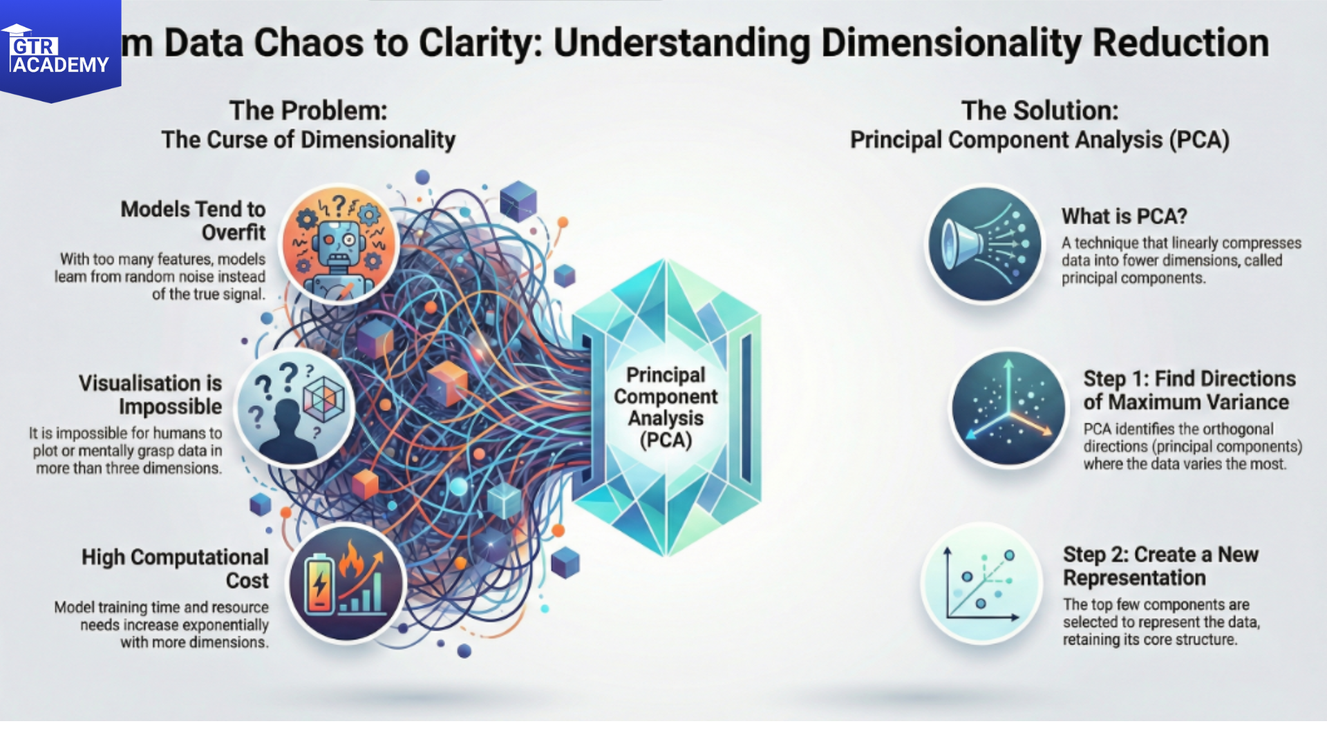
The curse of dimensionality
Problems with high-D data:
- The curse of dimensionality: Distance measurements lose their meaning; most of the space is empty.
- Overfitting: The model learns noise instead of signal.
- Visualization: It is impossible to plot or grasp 100+ dimensions.
- Compute cost: Training goes exponentially slower.
Dimensionality methods seek a low, dimensional representation that retains as much of the relevant structure as possible.
PCA: Linear compression to maximum variance
- Principal Component Analysis (PCA) identifies orthogonal directions (principal components) that account for the most variance:
- Subtract the mean from the data. Determine the covariance matrix. Extract eigenvectors (directions with the greatest variance) and eigenvalues (quantity of variance). Top k components are used to represent the data.
Advantages:
It is linear, quick, and the components are easily interpretable as they are linear combinations of the original variables. Removal of noise and decorrelation.
Examples:
- Use PCA as a step in preparing data for modelling.
- Analyze and visualize groups of customers or sensor data.
- t-SNE: Nonlinear for visualization
- t-Distributed Stochastic Neighbor Embedding (t, SNE) is remarkable for 2D/3D visualization:
- Transforms high D distances into similarities.
Maps to low D space preserving local structure (similar items stay close). Uses t distribution in low D to avoid crowding problem.
Advantages:
- It makes visible to the human eye clusters as well as manifolds.
Limitations:
- It is not deterministic (random seed has an impact). Very slow on big data sets.
- It modifies the global structure of the data (it is better to use it just for data exploration, not for measuring distances).
Practical example: customer segmentation
Here is the workflow:
- text
- Raw data: 50 features (demographics, behavior, purchases)
- → PCA: top 3 components explain 85% variance
- → Plot PC1 vs PC2 → clear clusters emerge
- → t-SNE on same data → even crisper separation for viz
- → Use clusters to stratify models or target campaigns
- When and how to use them
Checklist for readers:
- PCA before modelling if (features >> samples) or high correlation.
- t‑SNE/UMAP for EDA and cluster discovery (sample first!).
- Always validate low‑D viz should align with business intuition.
Try this: Take a customer or product dataset with 20+ features. Run PCA to plot top 2 components. Do you see patterns that match known segments?
Subscribe for daily tools and patterns data teams live by!